I’m going to bore you all once again with mock-ups for cover of the book I’m hoping to get out the door soon. I really need your help. Here’s the original which a few folks thought needed some color.

So I added a bit of color. Obviously I’m not a cartoonist. My husband came by and said “Are you taking up coloring now?”

So I don’t know. Is the choo-choo train a little too much? Green bubbles a bit icky?
I woke up this morning with an absolutely fabulous idea for the back cover. No synopsis or bio. No glowing reviews but just this:

I know it’s not very professional but I honestly don’t expect to set the world on fire with this little book (only 48k words). I just promised someone I would republish it once I got the kinks out and she’s gone now.
What’s your opinion: Colored cartoons or not?
Choo choo train or no choo-choo train?
Thanks!

No artist, here, Jan, but I like both front covers. And the back cover is fantastic!! Can’t wait to read!!
Thanks Mary!
Have you considered a tank or a military ambulancia or MP jeep? I’d put that thin line back so as to give the idea of a road or rail track that the vehicle is climbing. And one curve ball, a small USA flag flying on the shell of the snail. Duke
Well since you’re the editor of said mess I will take your suggestions under advisement.
About the flag, if clearly red, white, and blue it might add to the feng shui of bar scene. Bring some color balance to drawing, not to mention the overall appropriateness of the place. I like the green bubbles, this is, after all, the US Army we are discussing. Finally, as a general’s belt, the buckle should be a bit larger and the belt a bit wider, more pronounced. Long history for those buckles and belts. Duke
Well I am glad you are going to republish this book – and keeping expectations low to reasonable is a nice way to present it to the world – and with that said, you really do not know how a book will touch lives and so all the more I am excited to get my hands on the book.
The back cover is clever and I could not stop reading it – so keep that. The colored words made it interesting and easy to read.
The front cover – regarding the items and colors?
I like the addition of color – but the carrot and greens on top might be a little too dark – so I would keep it colored but make it lighter? More translucent and a whisper of color so it is not top heavy and it goes with the bubbles and belly button rectangle.
—
This is a side note – but the words “other sorrows” feel a little out of place with the overall title. The large red “happy hour” with papyrus font seems too separate from the and other sorrows – maybe make it all red – or capitalize other sorrows? hmmmm just some thoughts
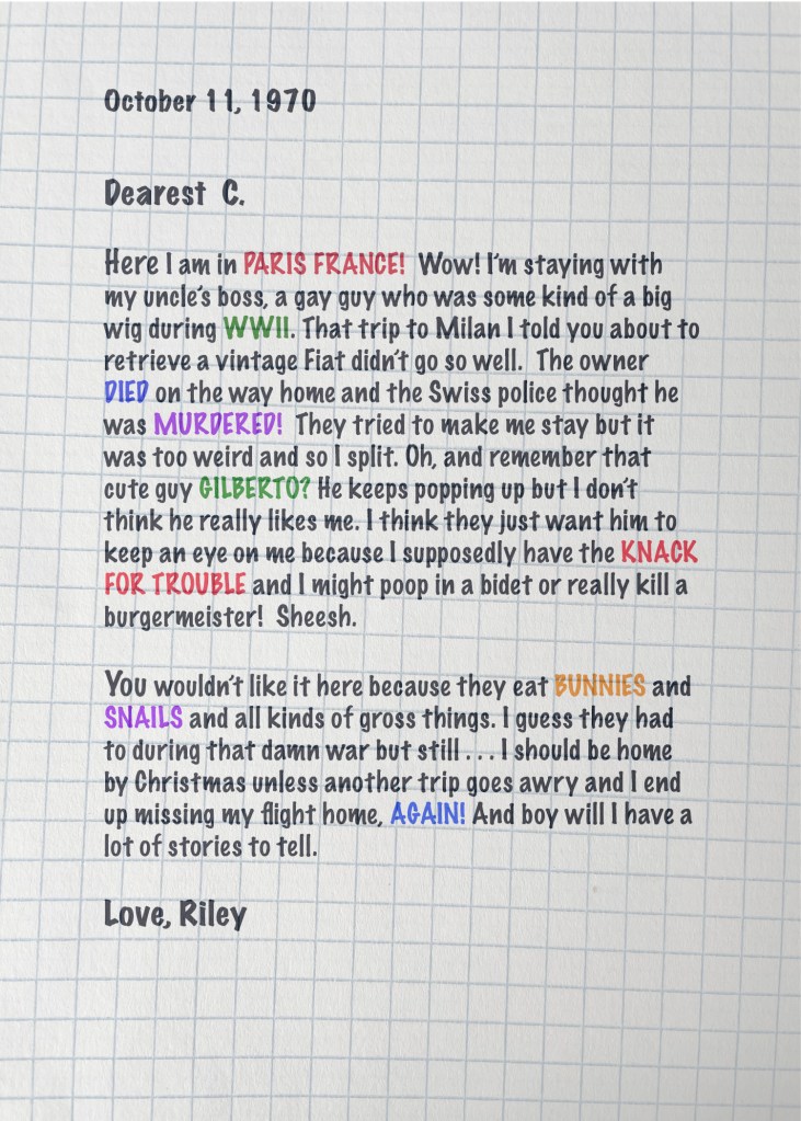
I’ll give those ideas a shot! Thanks! The book was written to be more entertaining than anything else. It’s working title for years was “Oncle Boob.” (and that’s not a typo). “Other sorrows” comes from a Rod McKuen record that was very popular in Europe back in the 70s.
Your humor and wit is a trademark and I am not surprised that Oncle Boob was a working title. hahahah – keep doing what you do and I look forward to seeing how it comes out.
Did I mention that I like the train? It adds something to make us curious and it seemed to balance the cover – although sometimes extra negative space is good – I do like the train too…
I know we were talking about this the other day, and I kind of like the first one. The back cover is excellent.
I like the first one better myself. But it was fun to “color.”
By the way, I saw this book on another blog, and it reminded me of you. The book has a simple, nice cover, similar to the one you’re working on. https://www.amazon.com/Days-Like-These-alternative-guide/dp/1035001667/ref=tmm_pap_swatch_0?_encoding=UTF8&sr=
That is nice ! Simple is often more difficult to pull off !
I know, but I think you’re there, and the final product is going to be awesome.
I like the little splashes of colour ☺️ And the blurb makes me want to read it!!!
Thank you!
The drawings are great… yours? For what it’s worth… I like the cleaner cover without the train, but with color. Maybe his tie could pop with something other than black?
Wishing you good luck with its release!
👍
The drawings were done by a cartoonist for The Overseas and Stars and Stripes. He sketched them on a notepad which he gave to me one night during Happy Hour. He said they would probably be rejected by “the brass.”
I love the back cover. As for the front one, I’d add a bit of color to each pic, like what you did with the carrot. I’d also make the drawings somewhat smaller, so that the title stands out more. Other than that, I think it’s gorgeous.
I think you’re right – the title needs to be more prominent. Thanks!
Welcome.
I like both options so no help with your decision. It’s fun to understand your process about how this cover is going to come to be.
I’m using Photoshop which I use like a toddler uses a fork. These ultra complicated programs don’t get any easier as my brain fogs up!
It’s a coin toss! Congrats on your book, Jan!
Thanks Susie. I’m tending toward using less color.
Jan, I like the original — without color — John likes the colored one better!
I’m with you Mary Alice. But it was fun to color!
I’d ask an AI to design a few variations, Where’s your name going?
I don’t know how to do that! Name – oh lord. Maybe Anonymous.
I like it! I’d say colour is always more eye-catching on the shelf.
I want to hear more about the book. I’m impressed with you as an artist and that you keep writing… inspire me!
I like it! I’d say colour is always more eye-catching on the shelf.
I want to hear more about the book. I’m impressed with you as an artist and that you keep writing… inspire me!
Thanks Cinda – I replicated a doodle by a cartoonist for the Stars and Stripes (a military newspaper) I met over fifty years ago! This is a rewrite of the Graduation Present – my second novel. I decided the original needed a little more humor and romance and a more believable ending. Hopefully!
Hi Jan, I like the colouring and the rain but that is me.
Thanks Robbie!
Coloured is fine. And I like the choo-choo train… (Chattanooga choo choo?)
I love it all, Jan!
You are very talented. Show it off!!!
I like both the black-and-white and version with color. They each add a humorous touch in their own way.